Worried that your WordPress site isn’t looking so hot on mobile? Don’t worry – it’s simpler than you’d expect to get your WordPress site mobile-friendly!
It is important to make sure your website is mobile-friendly by using responsive design, which will automatically adjust your website to fit the size of the device it is being viewed on. With the right adjustments, your WordPress site will be optimized for the best mobile experience possible.
In this article, we’ll cover everything you need to know to ensure that your site is mobile-friendly and ranks well on Google’s search results pages.
When it comes to having a WordPress site that’s optimized for mobile, you want to make sure it’s as easy as possible to use and navigate on smaller screens. This could include optimizing images, changing font sizes and spacing, and ensuring that all content is viewable without having to scroll horizontally. In other words, make your site as friendly as can be for those accessing it on their phones or tablets!
Why is it Important to Optimize Your WordPress Site for Mobile?
In today’s world, more and more people are accessing the internet on their mobile devices. In fact, mobile usage now accounts for over half of all internet traffic. This means that if your site isn’t optimized for mobile, you could be missing out on a huge amount of potential traffic.
Not only that, but Google now uses mobile-friendliness as a ranking factor. So, if your site isn’t mobile-friendly, you could be missing out on valuable search engine traffic as well.
Google also looks at other factors when ranking sites, such as page speed, security (HTTPS), and the overall user experience. All of these factors can have an effect on your website’s ranking, so it’s important to make sure your site is optimized for both desktop and mobile devices.
Additionally, you should make sure that your site is loading quickly and is secure. All of these elements will contribute to a better overall user experience, which will result in improved search engine rankings.
How to Optimize Your WordPress Site for Mobile
Now that we’ve covered why it’s important to optimize your WordPress site for mobile, let’s dive into how to actually do it.
The first step is to make sure your theme is set up for mobile responsiveness. This means that your site will automatically adjust its layout to fit different screen sizes.
To check if your theme is mobile-friendly, you can use Google’s Mobile-Friendly Test. This will give you an indication of how your site looks on mobile devices. After you’ve confirmed that your theme is mobile-friendly, you can move on to the next step.
1. Choose a Mobile-Friendly WordPress Theme
The first step to optimizing your site for mobile is to choose a mobile-friendly WordPress theme. This means selecting a theme that is responsive, meaning that it adjusts to fit the size of the screen it’s being viewed on. There are many free and paid themes available that are optimized for mobile, so make sure to do your research before settling on one.
2. Use a Mobile-Friendly Plugin
In addition to choosing a mobile-friendly theme, you’ll also want to use a mobile-friendly plugin. This will help to optimize your site for mobile by compressing images, minifying CSS and JavaScript files, and optimizing your site’s code. Some popular mobile-friendly plugins include WPtouch, Jetpack, WP Mobile Menu, AMP for WP, and WP Mobile Detect.
WPtouch Mobile Plugin

WPtouch is one of the most popular mobile-friendly WordPress plugins. It allows you to create a mobile version of your website without affecting your desktop version. The plugin automatically detects if a user is browsing your site from a mobile device and serves up the mobile version of your site. WPtouch is highly customizable, and you can change the look and feel of your mobile site with a few clicks.
Features of WPtouch Mobile Plugin
- Automatic device detection and mobile site rendering
- Highly customizable theme options
- Google Analytics integration
- Multiple language support
- Compatible with most WordPress themes
Jetpack
Jetpack is a comprehensive WordPress plugin that includes a suite of tools to improve the performance and security of your site. One of the features of Jetpack is its mobile theme, which allows you to create a mobile-friendly version of your site. Jetpack’s mobile theme is fully responsive and looks great on all mobile devices.
Features of Jetpack
- Comprehensive suite of tools for WordPress
- Mobile-friendly theme included
- Automatic image optimization
- Site security features
- Site performance features
WP Mobile Menu

WP Mobile Menu is a mobile-specific menu plugin that makes it easy to create a mobile-friendly menu for your site. The plugin adds a customizable, responsive menu to your WordPress site, allowing users to navigate your site easily on their mobile devices.
Features of WP Mobile Menu
- Easy to set up and customize
- Fully responsive and mobile-friendly
- Multiple menu styles available
- Supports multi-level menus
- Integrates with popular WordPress themes
AMP for WP – Accelerated Mobile Pages
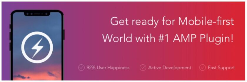
AMP for WP is a plugin that creates Accelerated Mobile Pages (AMP) versions of your site’s pages. AMP is an open-source project that helps improve the performance of mobile websites by reducing page load times. AMP pages are designed to load quickly and look great on mobile devices.
Features of AMP for WP
- Automatically creates AMP versions of your site’s pages
- Highly customizable design options
- Google Analytics integration
- Compatible with most WordPress themes and plugins
- Built-in support for Google AdSense
WP Mobile Detect

WP Mobile Detect is a mobile detection plugin that allows you to serve different content to users depending on the device they’re using. With WP Mobile Detect, you can create custom content for mobile users, such as different images, text, or even entirely different pages.
Features of WP Mobile Detect
- Mobile device detection and redirection
- Customizable mobile-specific content
- Multiple device detection options
- Lightweight and fast-loading
- Compatible with most WordPress themes and plugins
3. Optimize Images
One of the biggest factors that can slow down your site on mobile is large images. To optimize your images for mobile, you’ll want to compress them as much as possible without sacrificing quality. There are many free image optimization tools available, such as TinyPNG and Smush.it.
Also Read: Top 8 WordPress Image Optimization Tips: Boost Your Website’s Loading Speed
4. Adjust Font Sizes and Spacing
Another important factor to consider when optimizing your site for mobile is font sizes and spacing. Make sure that your fonts are large enough to be easily read on a smaller screen, and that there is enough space between lines and paragraphs to make reading comfortable.
5. Eliminate Unnecessary Elements
Finally, you’ll want to eliminate any unnecessary elements from your site that could slow it down or make it difficult to navigate on a smaller screen. This could include things like pop-ups, large headers or footers, or complex navigation menus.
H3: FAQ
Q: How do I know if my site is mobile-friendly?
A: You can check if your site is mobile-friendly by using Google’s Mobile-Friendly Test. Simply enter your site’s URL and Google will tell you whether or not it’s optimized for mobile.
Q: Can I optimize my site for mobile without using a plugin?
A: While using a mobile-friendly plugin can make the process of optimizing your site for mobile much easier, it’s definitely possible to do it without one. However, it may require more technical expertise and take more time to complete.
Q: What if my site is already mobile-friendly? Do I still need to optimize it?
A: Just because your site is mobile-friendly doesn’t mean it’s optimized for mobile. There are always improvements that can be made, such as optimizing images and adjusting font sizes and spacing. Plus, optimizing your site for mobile can help to improve its overall performance and user experience.
Conclusion
In conclusion, optimizing your WordPress site for mobile is a crucial step in ensuring that it performs well on all devices and ranks well on Google’s search results pages.
By choosing a mobile-friendly theme, using a mobile-friendly plugin, optimizing images, adjusting font sizes and spacing, and eliminating unnecessary elements, you’ll be well on your way to creating a mobile-friendly site that your visitors will love.
So, don’t delay – start optimizing your site for mobile today and reap the rewards of increased traffic and improved search engine rankings!